The original loading state

Dec 13, 2025

I spend a lot of time at work thinking and designing (and avoiding) loading states, and someone just reminded me of a piece I wrote ten years ago, so I just moved it from Medium to my new website, and updated with new things I learned.

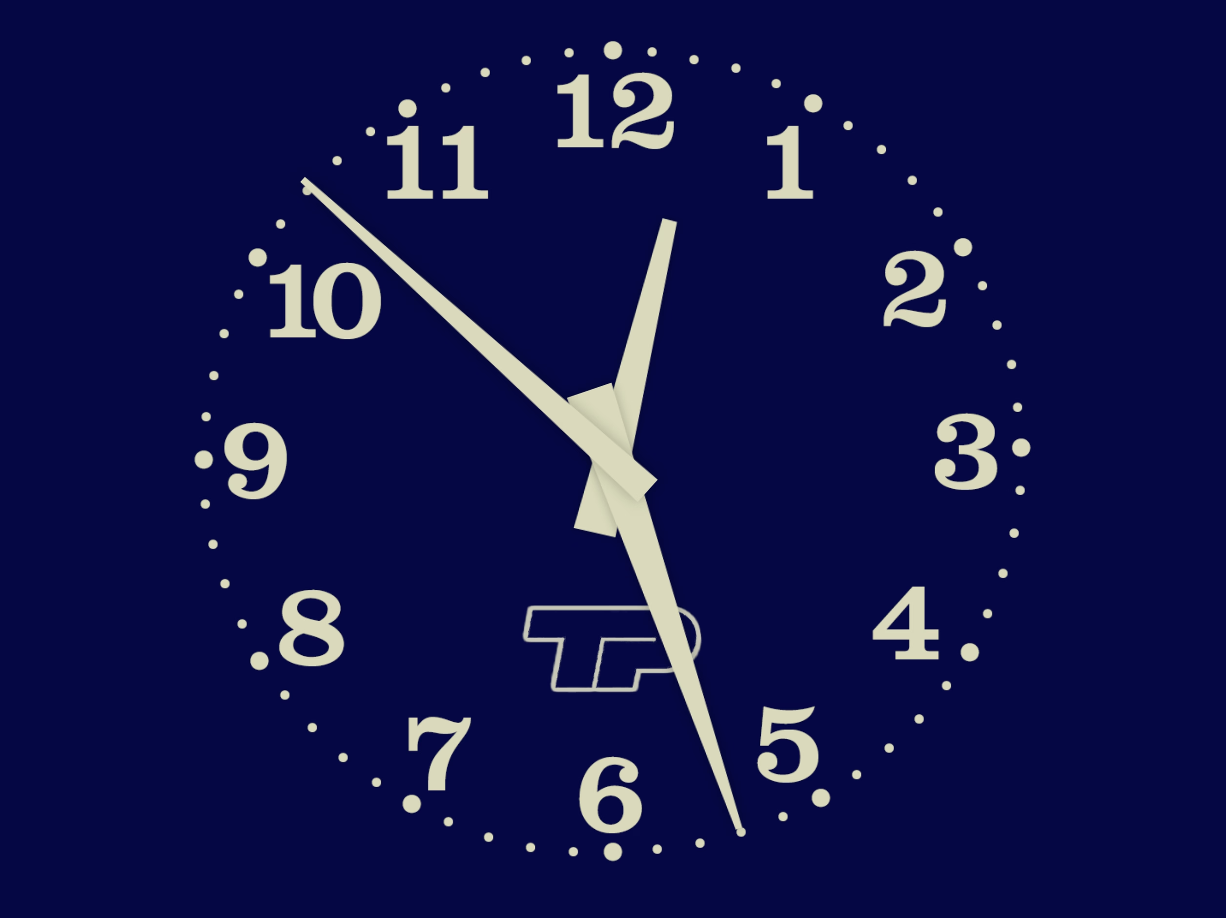
It’s about TV clock idents and what they meant to me growing up – possibly the original “loading state” in my life.

Of course, really, nothing compares to the absolutely banging BBC News “loading state”, which is fantastic, infinitely memeable, and brilliant even before you realize it cleverly incorporates the historical Greenwich Time Signal in it in a way that absolutely gives me chills.

Best comment under that BBC News theme: “As a swiss, this makes me proud to be british.”

What is it about Brits and extraordinarily perfectly timed music? Here’s Pet Shop Boys and Casting a shadow, made especially for and matching the total solar eclipse in 2000 to within half a second.

Got your back

Dec 13, 2025

An extremely thoughtful moment in DaVinci Resolve. When you drop the first video clip into a new project, it suggests to update the settings of the entire project, on the correct assumption that the first media might set the tone of the whole thing.

“You can’t undo this action” is scary and kind of… untrue? But I’ve stopped reading by then. I press Enter and it saves me a trip to a complex project settings dialog box I always forget the location of.

“In my greatest hour of need, where were you”

Dec 13, 2025

Made me laugh. lanyardigan on Bluesky:

“The focus on optimization was a time-limited social fact”

Dec 13, 2025

From Dave Karpf’s essay:

From the vantage point of 2025, optimization is clearly no longer a priority for the tech platforms. Google’s search results have gotten worse. Google doesn’t care. Facebook is awash in AI slop. It welcomes the slop. Amazon is filled with fake products and fake reviews. All of these companies still dominate their categories. Degrading the user experience isn’t costing them. The motivating belief that these companies had to optimize, or else they would be out-competed, no longer drives Silicon Valley behavior. Optimization was an era. That era has ended.

Hidden inside that essay is also a link to The Resonant Computing Manifesto, with this good paragraph:

Most of us got into tech with an earnest desire to leave the world better than we found it. But the incentives and cultural norms of the tech industry have coalesced around the logic of hyper-scale. It's become monolithic, magnetic, all-encompassing—an environment that shapes all who step foot there. While the business results are undeniable, so too are the downstream effects on humanity.

“They’re just ugly fonts”

Dec 13, 2025

I’ve always been curious whether those “dyslexic-friendly” fonts amount to anything, and this 2022 post I haven’t seen before puts this idea to rest:

But the new fonts—and the odd assortment of paraphernalia that came before them—assume that dyslexia is a visual problem rooted in imprecise letter recognition. That’s a myth, explains Joanne Pierson, a speech-language pathologist at the University of Michigan. “Contrary to popular belief, the core problem in dyslexia is not reversing letters (although it can be an indicator),” she writes. The difficulty lies in identifying the discrete units of sound that make up words and “matching those individual sounds to the letters and combinations of letters in order to read and spell.” 

(via Daring Fireball, whom I quoted for the title, via Jens Kutílek, whose fonts I use)

“Kinda love this error message on the bus”

Dec 12, 2025

Ash K on Mastodon:

“It was fun and I learned a lot”

Dec 11, 2025

From Dmytro Tovstokoryi at Mintlify:

I recently joined Mintlify as a part-time design engineer. […] I started a daily thread sharing UI fixes and improvements that I was shipping. I also invited people to share any UI bugs they noticed.

People responded. I fixed things in near real-time. It was fun and I learned a lot.

I enjoy little posts with updates like this.

(However, a small thing: I wouldn’t use text-shadow this way. It’s veering into the territory of faux bolding, and looks bad. And, in this case, it feels like it’s not solving a problem.)

“The internet is wrong, and I am here to set it right”

Dec 10, 2025

Computers Are Bad is an acquired taste and I’m acquiring it. This was an excellent post going deep into the myths and anti-myths of elevator close door buttons, and pedestrian crossing buttons. I love storytelling + rigor:

First, anyone who says that the "door close" buttons in elevators are routinely "not even hooked up" shouldn't be trusted. The world is full of many elevators and I'm sure some can be found with mechanically non-functional door close buttons, but the issue should be infrequent. The "door close" button is required to operate the elevator in fire service mode, which disables automatic closing of the doors entirely so that the elevator does not leave a firefighter stranded. Fire service mode must be tested as part of the regular inspection of the elevator (ASME A17.1-2019, but implemented through various state and local codes). Therefore, elevators with a "door close" button that isn't "hooked up" will fail their annual inspections.

Also, this bit was delightful:

The software, as I recall, came from the school of industrial software design where a major component of the interface was a large tree view of every option and discoverability came in the form of some items being in ALL CAPS.

“This cognitive load is invisible and rarely discussed”

Dec 9, 2025

From Scott Jenson’s 2021 post about Tesla 3 interface, this is so clever (emphasis mine):

Edward Tufte has this visual rule that 1+1=3: With a single line on the screen, you have just that single object, but adding a second line does something interesting, it adds a third ‘object’ on the screen, the negative space between the two. All good visual designers deeply understand this effect.

In UX design we have a cognitive equivalent. If you have two buttons, there is a third ‘object’ created: the decision a user must make on which button to tap.

Really into keyboards

Dec 9, 2025

Appreciate little moments showing utmost keyboard orientation in Raycast.

The millisecond you hover over the back button, the app says “you should be using the keyboard for this”:

I am not sure you often see tooltips on buttons, with keyboard shortcuts only:

Every select menu – even those with literally two options – has an inline search:

Party like it’s 1983! Or 1982! Or 1967!

Also, unrelated, love the clarity of this panel. This is what’s synced. This is what’s not.

“Every aspect of the machine operates as quickly as the user can move”

Dec 9, 2025

Evergreen and inspiring from Craig Mod, a 2019 plea for fast software:

Google Maps is dying a tragic, public death by a thousand cuts of slowness. Google has added animations all over Google Maps. They are nice individually, but in aggregate they are very slow. Google Maps used to be a fast, focused tool. It’s now quite bovine. If you push the wrong button, it moos. Clunky, you could say. Overly complex. Unnecessarily layered. Perhaps it’s trying to do too much? To back out of certain modes — directions, for example — a user may have to tap four or five different areas and endure as many slow animations.

Funnily enough, I feel that way about Apple Maps. I abandoned is since small things felt heavy, mired in superfluous swipey animations that felt like driving a 1960s car. Luckily, this was at the time Google Maps redesign its tiles to match Apple’s, so I got what I wanted to begin with, although in a slightly shady way.

I miss Sublime Text and might take it again for a spin (VS Code and Atom felt slow, Nova is delightful but also struggles in performance, even on simple things).

I miss Notes feeling lightning fast.

“Apple abandons its own guidance”

Dec 8, 2025


A good post by Jim Nielsen about icons in menus (in Tahoe).

This posture lends itself to a practice where designers have an attitude of “I need an icon to fill up this space” instead of an attitude of “Does the addition of a icon here, and the cognitive load of parsing and understanding it, help or hurt how someone would use this menu system?”

It seems a necessary ingredient of introducing icons to menus is thoughtfulness and guidance around when the icons are necessary/useful and when not.

It doesn’t help that the Tahoe icons seems to mess up indentation. (I haven’t updated to Tahoe and might skip it altogether. Even just the planetary-scale rounded corners are something that feels very broken.)

“How can I delete and add to library at the same time”

Dec 7, 2025

An absolutely eviscerating 18-minute walkthrough of Apple Music for macOS Catalina, from a few years ago. More funny than anything else, but a reminder to test the “boring” edges of your app – like a state with a lapsed subscription, or coming back after a few months.

There’s no way to drag and drop. […] If I want to add this to here, I have to go through this bullshit, and when I do, it takes seconds again.

Also, an ode to a well-functioning back button, and well-behaving loading states. Those things add up so quickly.

(My debugging brain understood what populated the confusing History entries – I bet it was the early play sequences that went through a bunch of stuff without playing.)

“Ugly in a way that’s pretty”

Dec 7, 2025

I gave a talk about the craft of pixel fonts at Config last year, and this fresh YouTube video by Noodle seems to be a great and quirky companion to the whole issue of “how did pixels look on old CRTs,” including many examples from modern games.

⌘-P ⌘-S

Dec 7, 2025

A really interesting convention I just spotted in DevonThink that shows the shortcuts as soon as you hold ⌘, although it feels a bit clunky and cheap in execution.

(The main worry here for me would be that it’s distracting if you already know the shortcuts. I haven’t noticed it disappear if you use it, but maybe it does after a while.)

“OK cool now we can ship the game phew. But why did this EVER work?”

Dec 6, 2025

Tom Forsyth wrote about a fun bug in a Half-Life 2 reissue, of a particular flavour I have never heard before.

So I started it up, selected new game, played the intro section. It's a fairly well-known section - you arrive at the train station with a message from Breen, a guard makes you pick up a can, and then you have to go into a room and... uh... I got stuck. I wasn't dead, I just couldn't go anywhere. I was stuck in a corridor with a guard, and nowhere to go. Bizarre.

“Especially helpful during live shows”

Dec 6, 2025

Fascinating quick walkthrough of Strudel on TikTok from DJ_Dave (sound on!). Sometimes you see an interface and you immediately just sense how efficient and fun and powerful it is, without ever touching it.

Very bretvictorian in a way. Also related: a recent video from Benn Jordan walking through obscure music software used by Aphex Twin.

“And then the system crashes”

Dec 5, 2025

From Nina Kalinina’s excellent revival of a forgotten 1983 GUI, a discovery of a hilarious accessibility bug:

VisiOn loves to beep at the user. It beeps every time a menu option is chosen or an on-screen button is clicked.

If you are tired of the noise, you'd appreciate that Application Manager has an option to replace the sound with a "visual beep". It is implemented as a flashing area of 32x16 pixels around the mouse cursor. Every time the flashing is about to happen, an image "below" the cursor is preserved in RAM to be restored after the "visual beep" is over. However, the memory allocated for this bitmap is never freed. It takes between 200 and 1000 clicks to fill the RAM with useless copies of the mouse cursor, and then the system crashes.

If you have never heard of VisiOn, The Digital Antiquarian has a fun walkthrough that also happens to be the first chapter of an excellent series about the history of graphical user interfaces.

“Never criminalize pride in craft”

Dec 4, 2025

From Jeff Veen:

It reinforces my belief that teams need a culture that values attention to detail when building products. Tiny annoyances so often get neglected as we rush to ship, but the consequences accumulate, souring the whole brand. It’s not a long journey from “Ugh, these AirTags…” to “Apple has lost their way…”

But in my experience, those rough edges seldom go unnoticed by someone, somewhere, who was unable to stop the momentum of a product release for such an “insignificant” flaw. Or, even more consequentially, they did not feel it was safe to do so.

I want to quote so much of this essay, so I’m going to do just that.

I’ve always felt that culture is made of the accumulation of small acts of gracious leadership: acknowledging moments of bravery during a retro, teasing out a reticent comment during a product review, and on and on. It can come from other places too, but it is most effective when it comes from the top.

If you’re leading a team remember: Never criminalize pride in craft.

“More nuanced, more expert, interaction design skills”

Dec 4, 2025

Scathing from John Gruber:

I think the fact that Liquid Glass is worse on MacOS than it is on iOS is not just a factor of iOS being Apple’s most popular, most profitable, most important platform — and thus garnering more of Apple’s internal attention. I think it’s also about the fact that the Mac interface, with multiple windows, bigger displays, and more complexity, demands more nuanced, more expert, interaction design skills. Things like depth, layering, and unambiguous indications of input focus are important aspects of any platform. But they’re more important on the platform which, by design, shoulders more complexity. 

A great read – harsh, but deserved. It’s good to punch up. I don’t have a lot of context on Alan Dye, but the parts that resonated the most was appreciation of the craft of interface and interaction design for complex things. iOS has had occasional sprinklings of great interaction design, especially in its physics-based gestures that blossomed since iPhone X. macOS feels abandoned in this regard, with even hard-won victories like fast Finder and great user preferences deteriorating.

“Fight my way through it all again”

Dec 4, 2025

From my friend Robin Rendle:

But here’s what modern UI design looks like: There’s always a confusing title; it doesn’t quickly tell me what to do or what it wants me to understand; beneath that there’s a subtitle, explaining the title again; beneath that there’s several sentences that restates the title and subtitle but simply jumbles all the words around to make it justify its existence; then the button—there is always a button—and it asks me to “Confirm” or “Apply” but as to what I’m confirming or applying I have absolutely no idea unless I go back to the text and fight my way through it all again.

Kept nodding through this whole essay. I don’t love nervous user interfaces that share their own problems and insecurities with their users. I love confident interfaces that know exactly what to say, and don’t outstay their welcome.