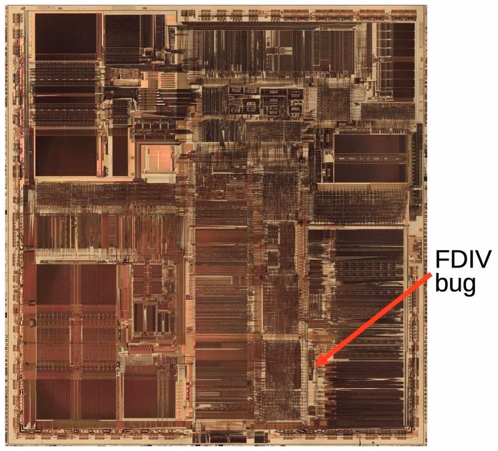
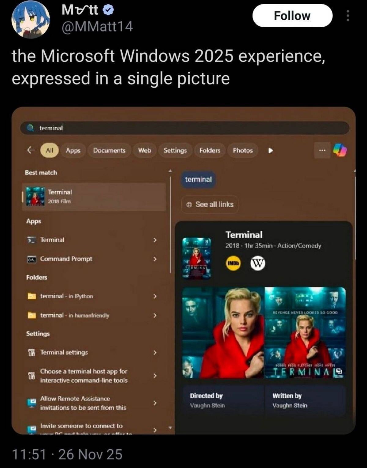
A fascinating deep dive look at one of the most well-known bugs in computing history, the 1993 Pentium FDIV bug. Ken Shiriff actually grabbed a microscope to analyze the processor and mapped out exactly what happened on the hardware level, and the details of Intel’s (surprising) fix.
Also, an interesting detail of what ended up being Intel’s self-own:
The problem might have quietly ended here, except that Intel decided to restrict which customers could get a replacement. If a customer couldn't convince an Intel engineer that they needed the accuracy, they couldn't get a fixed Pentium. Users were irate to be stuck with faulty chips so they took their complaints to online groups.
I mentioned speedrunning before in the context of mastery, but there is the other side of speedrunning that’s equally interesting: that utilizing bugs (or, glitches) to get the fastest possible time.
This 17-minute video by Msushi covers “one of the most loved and broken glitches in Portal 2” and the strange relationship the community has in following a bug to its conclusion – which, in this case, is not fixing it, but creatively using it to shave of speedrunning time. (There is an element of mastery there too, with spawning and despawning, but I don’t want to spoil the surprise.)
I added a table of contents UI to the most elaborate essays on my site, and then wrote about some of the design details and choices I made there. Let me know if this is an interesting case study! I tried to do something new here with tons of mini videos.
At the bottom, I will also be collecting other implementations I see that are interesting alternatives to my approach.
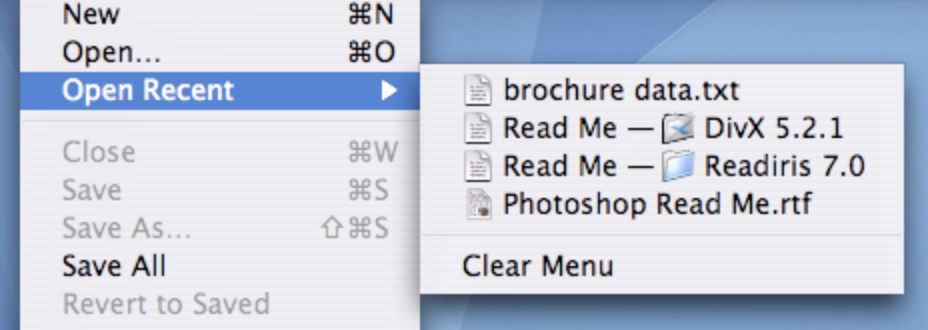
Let’s say you are in Reeder (an RSS reader for iOS), looking at the list of posts, and already from the title you know you don’t care, and you want to mark it as read.
You can tap to see it and then swipe back the moment it shows. This is the slow path.
There is a faster path. Reeder enables you to slide right or left on the item. You get nice haptic feedback, and many apps support this kind of an interaction.
But there is an even faster path.
You can tap to see it and immediately swipe back. Your thumb is already there on the left anyway, and the distance is a lot shorter now.
Like every advanced gesture this takes a bit of practice, but I noticed I started doing it instinctively, without even thinking.
This happening required two small design details: The original slide transition to be interruptible at any moment, and the app to support swatting/draging the incoming item away even if my finger was nowhere near it. Both are clever, and both feel very welcome, because they enabled this emerging (to me) behaviour that made going through the list snappy without me even realizing.
This might be a good modus operandi: Think of the slow interaction. Think of its fast version. Then, think some more.
Nicely done, Reeder team. (Or, if this is a default iOS behaviour, nicely done, Apple!)
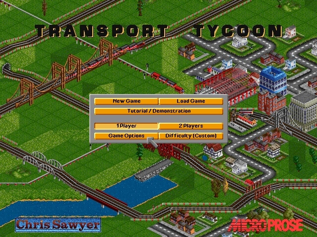
A 16-minute video from Ahoy from last year about Chris Sawyer, creator of Transport Tycoon and Rollercoaster Tycoon games from the late 1990s.
The video focuses more on the economics of the industry and some technical details, but what’s interesting to me was how tight those two games felt in terms of UI. They have a shared custom GUI, they are assembly-coded, and they felt perhaps like the last instance of a graphical user interface where it felt there was nothing standing between you and the pixels.
I know those are games and not productivity apps, but they can be inspiring for those, too. You can download OpenTTD, which is a modern recreation of Transport Tycoon Deluxe that doesn’t require emulation, and it still captures the snappy and tight feeling very well.
I’m thinking about it in particular because the web took a lot of that away. The web loves latency and loose interactions and reflow and temporary fonts and CSS leaks and text sticking out of the box and many other papercuts. It’s nice to be reminded of the world where things were closer to the metal, and how that felt as a user.
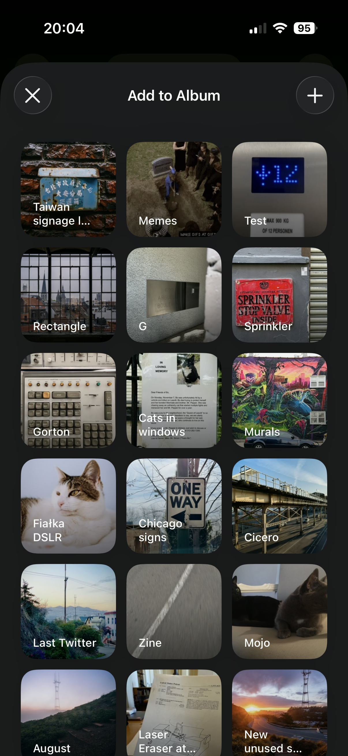
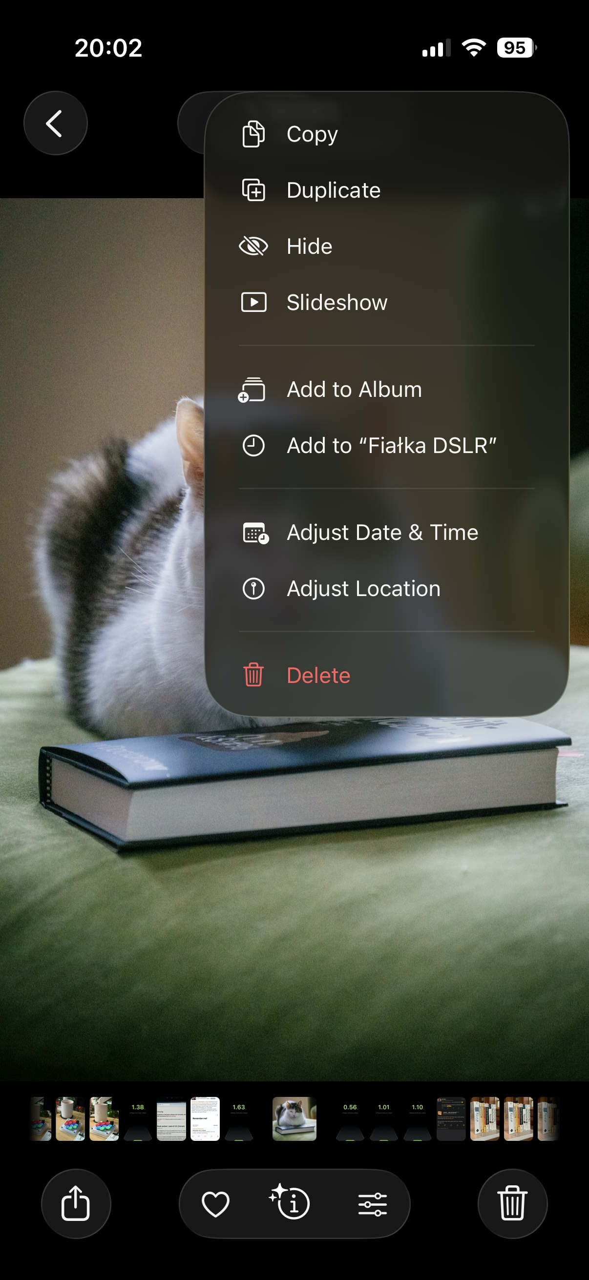
One of my favourite recently-noticed little patterns is this one thoughtful accelerant in iOS Photos.
If you want to add a photo to an album, you normally have to choose from a list of albums:
However, once you do that one time, a new menu option appears. It’s effectively “Add again quickly to the album you just chose” (Fiałka is the name of my cat):
That skips the album selection altogether. It’s always only just one album you used more recently, so it’s relatively simple… but so helpful. You often, after all, want to add more stuff to the same album, and it saves you choosing the same album over and over again.
This is great because it flattens the option space to zero options, which mirrors how we all think when we’re focused. It’s tunnel vision exactly when you want it.
I have always been a fan of both “repeat”-type actions and smart “recent”s, and consider them a truly underappreciated secret weapon. Those little savings really add up over time – in saved time, in less tedium, and in avoided mistakes. (Imagine not only having to choose the same album for 30th time in a row, but also… making a mistake doing that and tapping on a wrong one! Then the frustration very quickly compounds, as you have to recover from something that felt completely avoidable.)
I always respect designers of interfaces that invest in functions like these. There is also an anti-corollary to this, which is: if there’s only one option, consider not even asking. Slack seems to excel (derogatory) here:
The second one is somewhat defensible since it’s a settings dialog you enter at your own will, although the active “Re-generate answer” when I haven’t done anything (and nothing can be done) feels overbuilt.
But the first of these always appears on a way to other settings (like adding emoji), and it’s even worse than the Remember me? examples because it repeatedly stops you for absolutely no reason at all.
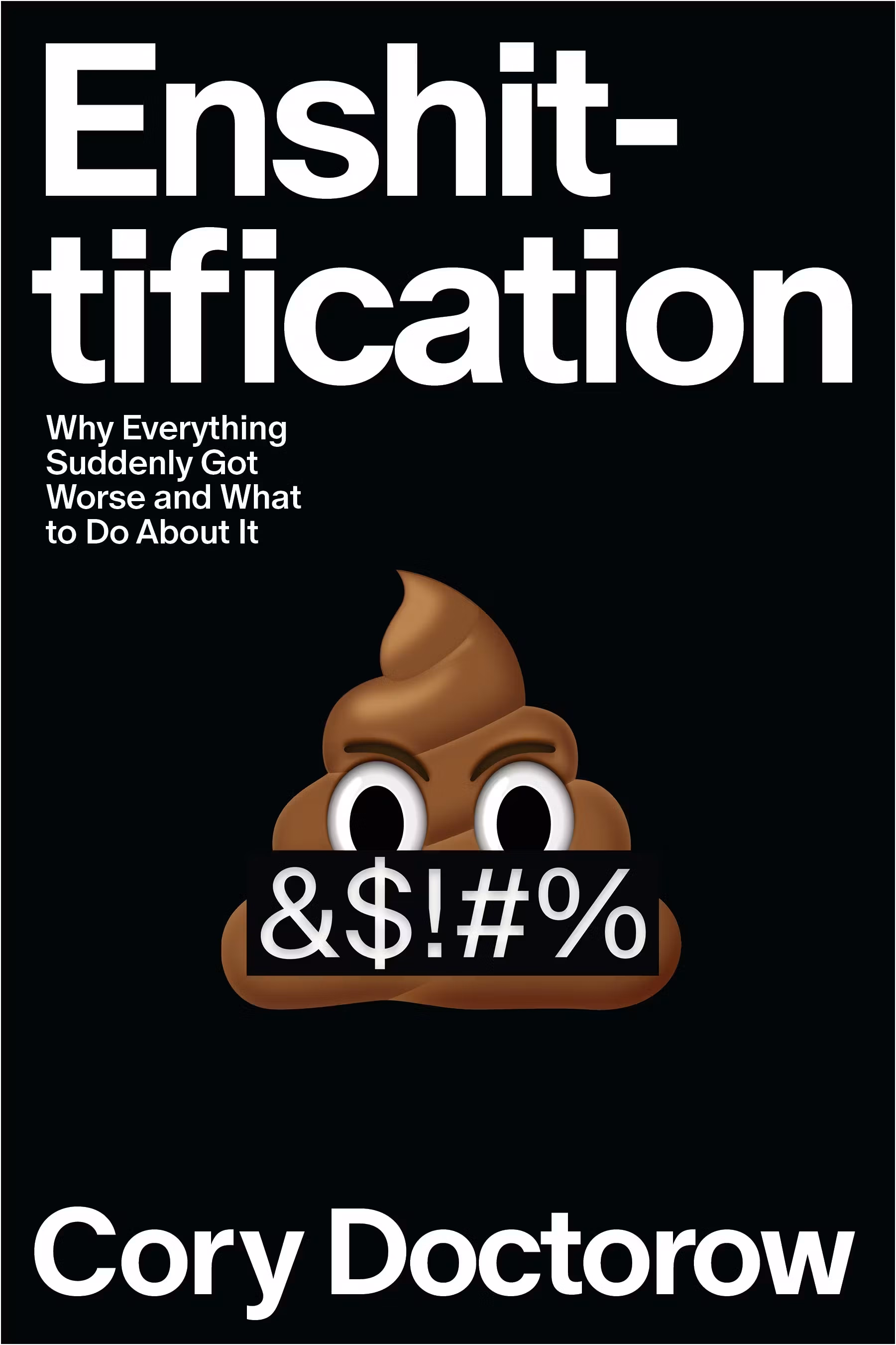
I liked this book. I consider Cory Doctorow a good, smart writer. He can put together one good sentence after another (“this is why the roads leading to Amazon depots are littered with sealed bottles of human urine”), he can tell stories of boring things in riveting ways, and he can connect various themes and events.
This last bit was a (positive) surprise. The book is a tour of what felt a more vast universe than I imagined. Turns out, the reasons for enshittification are complex and spanning many systems. There are case studies – most you’ve probably heard of – but this really feels like a book in that each one comes with extra depth: details, detours, history. The book travels through a lot of places and teaches quite a few things: computer history, arbitration laws, stock market, history of unions. I would not be surprised if everyone reading this finds a jumping off point to dig deeper into a certain area.
I also didn’t mind the tone – angry, but not too angry, blunt, but not cynical, with an entire section at the end dedicated to “now we rebuild” and some examples of what we’re already getting right.
Only two small complaints:
The book loses a bit of steam at the end. It might be simply that suggesting improvements is naturally harder than riveting stories of Things Gone Poorly, especially if those improvements are systemic and legal. But maybe it could just be a bit shorter.
Cory Doctorow also loves coinage, which – well, justified, seeing how the word that became the book’s title helped the idea travel! But there’s a lot of others words around: enshitternet, disenshittification, twiddling, chickenization… There’s this sentence in the book: “There’s something genuinely wonderful about workers who counter-twiddle their bosses’ apps and escape reverse-centaurism.” There are more like it. At this point, this feels like just bad UI.
But those are smaller things. Overall, this is worth a read. To me, it added a lot more higher-level understanding of systems and processes that lead to bad software (not an altitude level I find myself in), and packaged it nicely into a story.
I’m going to finish by listing a few passages that particularly stuck with me.
Page 34:
Companies don’t treat you well because they’re “good” capitalists and they don’t abuse you because they’re “bad” capitalists. […] Companies abuse you if they can get away with it.
Page 51:
Enshittification – deliberately worsening a service – is only possible when people value that service to begin with. Enshittification is a game of seeking an equilibrium between how much people like the thing that locks them to the service (often, that’s other people) and how much they hate the management of that service.
Page 106:
The death of competition […] doomed regulation. Competition is an essential component of effective regulation, for two reasons: First, competition keeps the companies within a sector from all telling the same lie to its regulators. Second, competition erodes companies’ profits and thus starves them of the capital they need to overpower or outmaneuver their regulators.
Page 129:
That long delay after you reach a web page but before it shows up in your browser? That’s the “surveillance lag,” the delay while all those [advertising] auctions are concluded.
Okay, so maybe I don’t mind all of the newly minted words and coined terms. This one is sharp.
It was, I’d argue, a small mistake for Apple to stop putting a visual affordance in the lower right corner of windows to show where to click to resize the window. It was a bigger mistake to change the scrollbars on MacOS to look and work like those on iOS — invisible, except while you’re actually scrolling (by default, that is — savvy Mac users keep them always visible). The removal of the resize indicator happened long ago, in Mac OS X 10.7 Lion, released in July 2011.
I can recall at least one place in macOS where you can still see the resize grabbers – it’s in column view in the Finder.
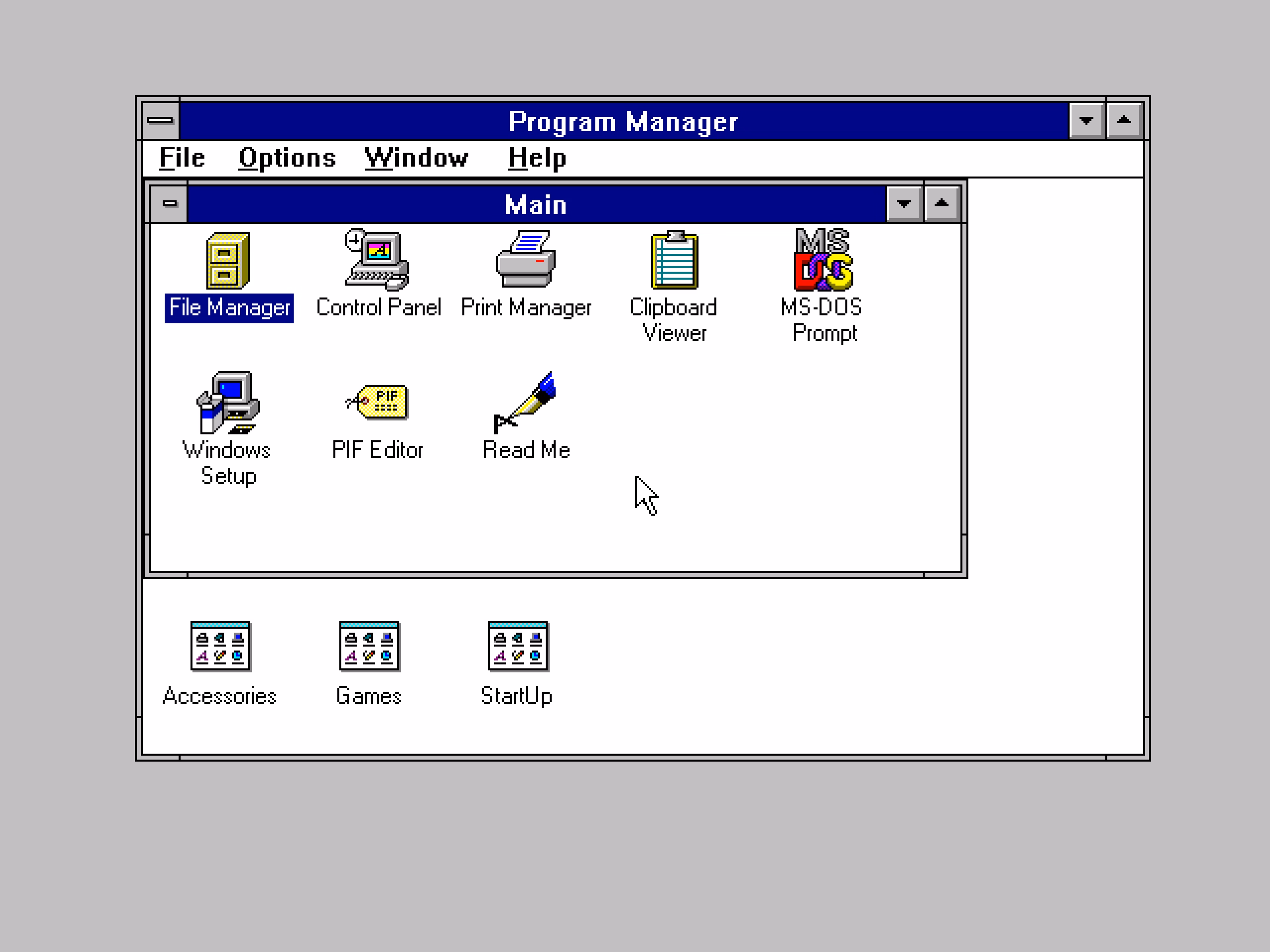
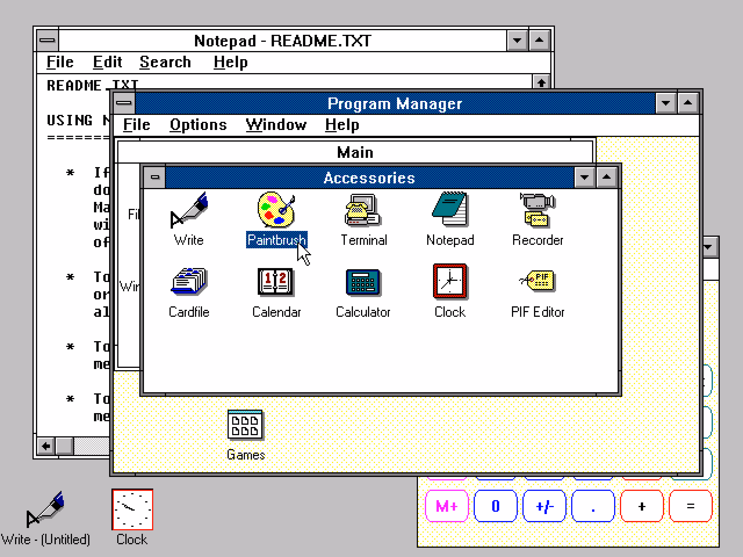
I still think sometimes of old Windows where all the 8 affordances for resizing were clearly visible. I know Windows 3.1 was generally kind of ugly, but I liked how they aligned with the title bar and the buttons:
By the way, don’t love Gruber’s “Dyehoe” thing in the title. Feels Trumpian.
It’s perhaps more technical than what I usually link to, but shows what can happen if someone really cares about performance. What’s interesting to me is that the author posits that it’s actually not an old website that is fast because it’s old… it’s actually kind of a melange of various techniques throughout the decades, from vintage solutions like spriting images, to more modern like JavaScript’s page history API, or pre-caching DNS.
Just visiting the website and clicking around can be inspiring because it reminds one that we gained a lot of computing power and network speed over the last decades, but most websites squander it. Not this one.
And it’s sad this kind of approach of a website appearing and not changing (no reflow, no pop-ups, no endless spinners, no infinite scrolls) feels so rare.
However, two caveats:
At around 7:35, Wes says “nothing else moves”… Oh yeah, it does. It’s perhaps my curse that I notice these things.
Also, the homepage now has an animated, delayed green banner you can see at the photo above. I hope they’re not losing their way.
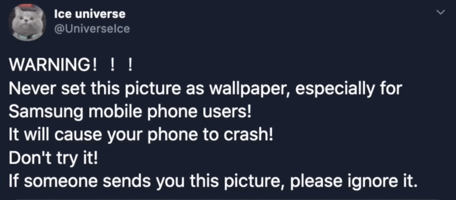
When home computers were new, there was this enduring myth of “killer poke.” POKE was a pretty low-level BASIC command that allowed you to write any number to any place in the memory, as there was no memory protection. From that developed a set of myths of the right magical pairs of numbers that could be input and cause permanent damage to the hardware of the computer, shared in nerd circles almost like campfire stories.
Wikipedia has a pretty dry set of those. The most exciting one there is annotated with [citation needed], and the message seems to be: by the 1980s, this was no longer possible. Even in the earlier version of this idea, Halt and Catch Fire, the “catch fire” was an exaggeration. Before then? Sure, I bet some user actions could damage the computer, but computers themselves, with their high-voltage vector CRTs, electromechanical parts, and even liquid mercury tanks early on, were not that hard to damage.
Unsurprisingly, there are more modern versions of “killer poke,” too. At this point, the best they can do is crash or hang your operating system, but they are still chased, and coveted, and mysterious.
This 10-minute 2021 video from Mrwhosetheboss is a fun story of a wallpaper that could crash your Android OS. I’m not going to spoil the surprise, but it’s not what I expected – although the moment you see the wallpaper in question, you might figure it out.
It’s a fun video, and of that good kind that actually teaches you something.
Since upgrading to macOS Tahoe, I’ve noticed that quite often my attempts to resize a window are failing. This never happened to me before in almost 40 years of using computers. So why all of a sudden?
I understand this might be the casualty of the absurdly large border radii in the new macOS.
The little video in the middle made me laugh:
(I do think there is room for gestures triggered “outside” a window, and we’ve seen rotation and some specific flavors of resizing or cropping work this way in drawing and design apps across the last few decades – but one has to be careful. Often, those are secondary and/or for power users.)
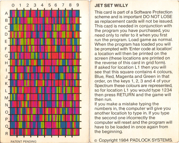
A 6-minute video from JHR about the 1980s British game Jet Set Willy, a big prize for its completion, the bug that made it unplayable, the copy protection, the hackers, and the mess of it all.
This feature can't pull back an email that's already gone; it just holds your message for five seconds so you have a chance to hit the panic button. And don't worry – if you close Gmail or your browser crashes in those few seconds, we'll still send your message.
There’s so much cleverness hiding in here: recognizing that this particular flavour of l’esprit de l’escalier exists, shifting time from the past to the near future, the repurposing of the undo branding, the fallback if things go wrong.
There was, I imagine, even the challenge of having to forget about the previous version of this feature elsewhere, which were the awful emails with RECALL: in the title, which I think maybe only worked in Outlookk, if at all? (Everyone else suffered like green bubble people do today.) I don’t know. Sometimes the biggest hurdle to a great idea is blocking bad execution you already know from your head. On the other hand, sometimes someone else’s bad execution can be motivating.
I even think that not using ⌘Z for this was a clever idea. ⌘Z without text editing context/focus can be really tricky. Do you remember when Safari had ⌘Z to bring back last closed tab before they came to their senses and used ⌘⇧T like Chrome?
It is sometimes harrowing when you want to click it Undo Send and just miss it – keyboard is more precise here – but not sure ⌘Z would register here. Even Esc would be tricky.
I miss when Gmail was in the “young and open to trying new things” phase.
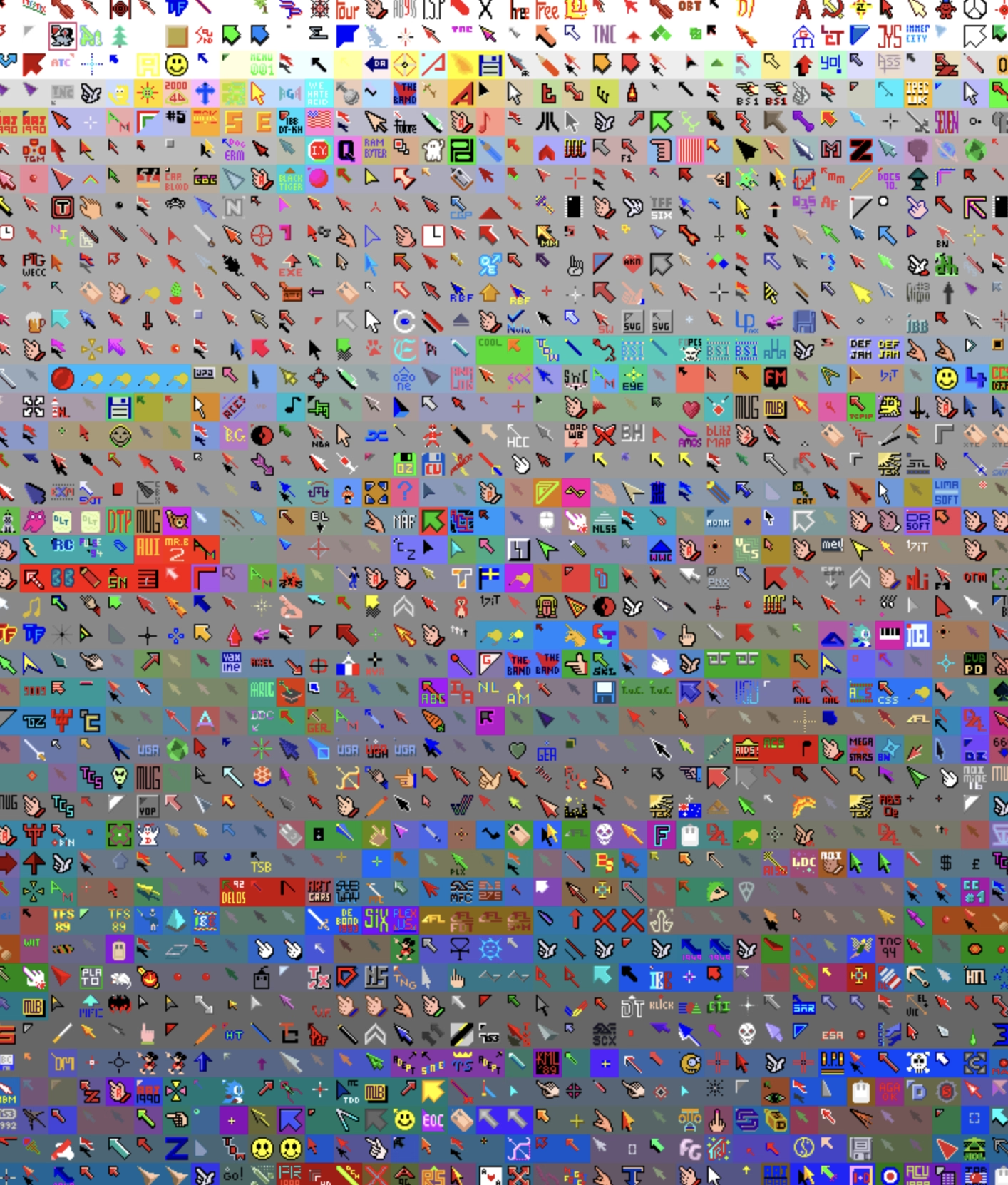
I have been wondering the other day why aren’t there more mouse pointer museums and here’s one – Amiga Pointer Archive! (Amiga was a 16-bit home computer especially popular in Europe.)
Doesn’t work so well on mobile, but it’s fun on desktop. I recommend zooming the page to 200%.
★★★★☆ (as a TV show)
★★★☆☆ (for the purposes of this blog)
During my year at Code For America, I saw many glimpses of truly bad technology – slow courtroom computers, infuriating interfaces, obsolete specs, and the inevitable layer of remote access GUIs atop it all that made everything worse. As much as I hated some of the consumer apps on my top-of-the-shelf iPhone back then – I saw things that were a lot more harrowing.
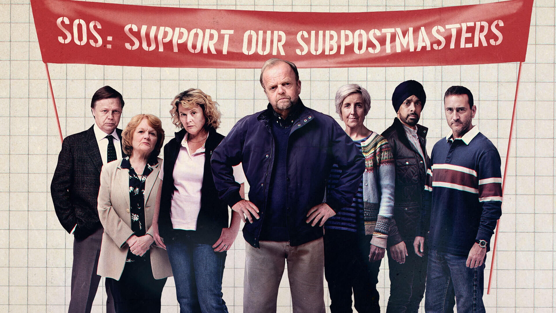
This British show from 2024 dramatizes the UK Post Office scandal I just learned about, in four one-hour episodes, and highlights how those kinds of things actually affect most people who aren’t tech-savvy.
As a TV show, it’s gripping and well done. Toby Jones is marvellous, and Monica Dolan, whom I didn’t know of before, is a standout. The many awards wone here are deserved.
Unfortunately, for the purposes of this blog, the show is lacking something: either the other side of the story (what were the systemic or structural problems that allowed this to happen inside The Post Office and Fujitsu?), or the technical details of the bugs (those are barely even mentioned to begin with). The exemplary last episode of Chernobyl solved this brilliantly in the courtroom, connecting the human drama with the technological and scientific underpinnings. I missed something like that here.
Still, the core (sorry, pun really not intended) of Chernobyl is not about the AZ-5 button or the positive void coefficient, and the Horizon scandal shouldn’t be reduced to bugs either. Overall, it’s not an easy watch, but worth seeing this to remind ourselves of powerlessness of people against both bad technology and bad systems, the challenges and power of collective action, and how much damage bad software can really do.
In America, the show is available on iTunes and on Amazon Prime.
I have never before heard of this story of an absolutely botched deployment of a new accounting system at the British post office, and “the widest miscarriage of justice in UK history.” More on Wikipedia:
Between 2000 and 2015, 736 subpostmasters were prosecuted by the UK Post Office, with many falsely convicted and sent to prison. The subpostmasters were blamed for financial shortfalls which actually were caused by software defects in the Post Office's Horizon accounting software.
Some of these bugs sound absolutely horrendous, and remind me of Therac-25:
The Horizon IT system contained "hundreds" of bugs. Some of those that came to light were named after the post offices where the bug first occurred. These bugs included: the "Dalmellington bug", where the system would enter repeated withdrawals in the ledger every time the user pressed Enter at a frozen interface screen; and the "Callendar Square bug", where the system would create duplicate database entries in the ledger.
This bit feels absolutely crucial and it seemed to me we have learned this lesson decades ago:
And while the technology had changed, the contract between the Post Office and subpostmasters, who owned their own businesses but were agents for the Post Office, remained the same. It stated that any accounting shortfalls were the responsibility of the subpostmasters unless they could prove otherwise. But without the chain of evidence created by paper-based accounting methods, proving the losses were not their fault was near impossible for many.
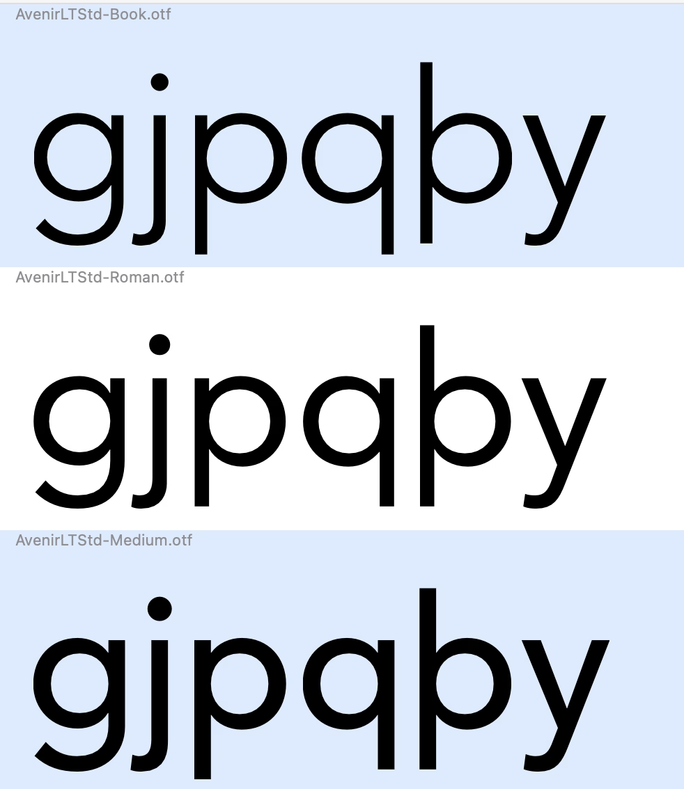
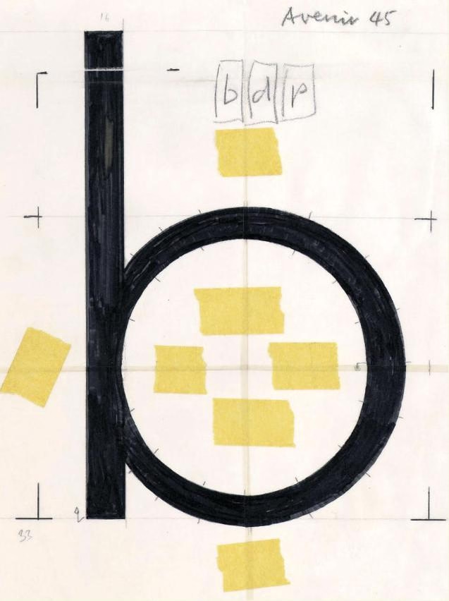
Did anyone ever notice that Avenir LT has some serious errors in the descender lengths of p and q in certain weights?
Florian Hardwig adds:
It’s one of the things that got revised in Avenir Next. But it’s bonkers that it hasn’t been fixed in the “legacy” Avenir that’s still being sold – and bundled with Mac OS – after all these years.
Downthread there’s an original Avenir drawing that for some reason I found very evocative:
The first iPhone famously introduced the soft keyboard, which could change its shape depending on the need. Sometimes it would mean becoming a keypad (for numeric entries), and sometimes something subtler, like introducing a “.com” key to the bottom row, or adding a new column of keys and making the keys a bit more narrow for a few languages that need that.
Bear (the note-taking app) does something interesting: after a button press, it replaces the onscreen QWERTY keyboard with a “funpad” or a “function keypad” (like StreamDeck or Figma Creator Micro). This achieves a similar result to a scrolling toolbar above the keyboard (see: Apple Notes), but in a different way. I haven’t seen anything like this before, and I think it’s really clever and it has worked well for me in practice.
(It also cleverly closes itself upon some actions like introducing a divider, but stays put for bolding, indentation, etc.)
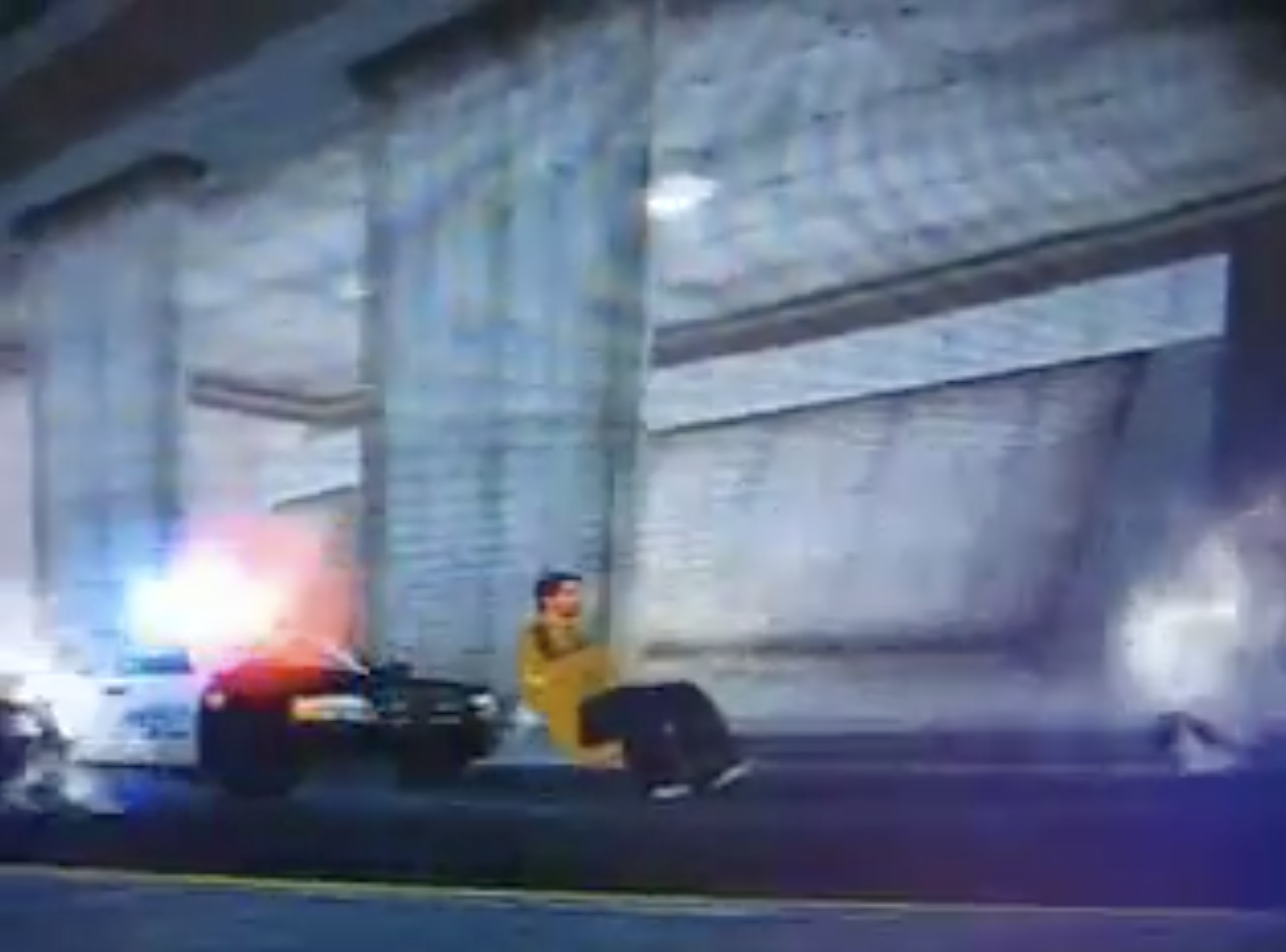
Perhaps the only ever musical that’s about a buggy piece of software. From the inimitable Cabel Sasser, this 2006 video about Saints Row, with three songs and a goddamn reprise at the end.
It’s very good.
my car door’s freaking out
it seems to be forever in the concrete barricade
I wonder how I'm ever gonna drive away
this really is isn’t my day
the sparks are flying
people dying
metal frying
and I wonder if there’s more to life
or if I’ll find that this is really it
this game is a piece of work
In my opinion, Apple took on an impossible task: to add an icon to every menu item. There are just not enough good metaphors to do something like that. ¶ But even if there were, the premise itself is questionable: if everything has an icon, it doesn’t mean users will find what they are looking for faster.
I always liked this kind of an exercise:
There’s a game I like to play to test the quality of the metaphor. Remove the labels and try to guess the meaning. Give it a try:
This is a gallery of elementary problems. None of this should have shipped if someone with power internally had a critical eye for consistency and detail. If Apple deems it necessary to retain the icons, though I am not sure why it would, it should be treating this post as one giant bug report.
This still remains one of my favourite pieces of UI ever designed. I know this is is not software, but this to me is exactly the right kind of “delight” in this context.
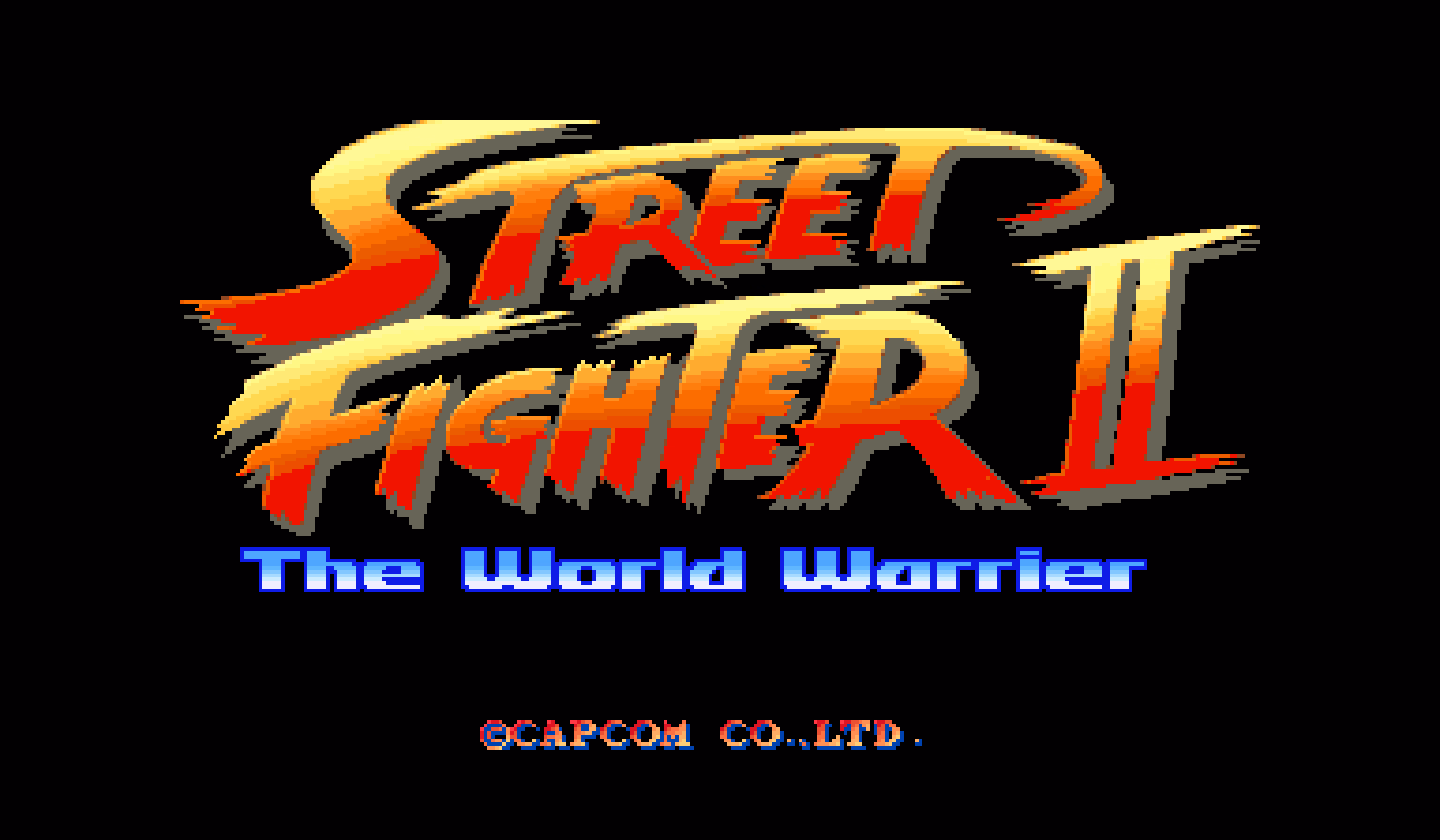
In 1991, just days before the final deadlines, Akira Nishitani, one of the graphic designers of the absolutely seminal arcade game Street Fighter II realized they misspelled the world “Warrior” as “Warrier.”
The typo was there for months and no one noticed. But the moment it was noticed, the graphic ROMs were already burned and impossible to change, and the code was due in three days.
What would you do? I’ll let you click through to read, but I really enjoyed this short story.
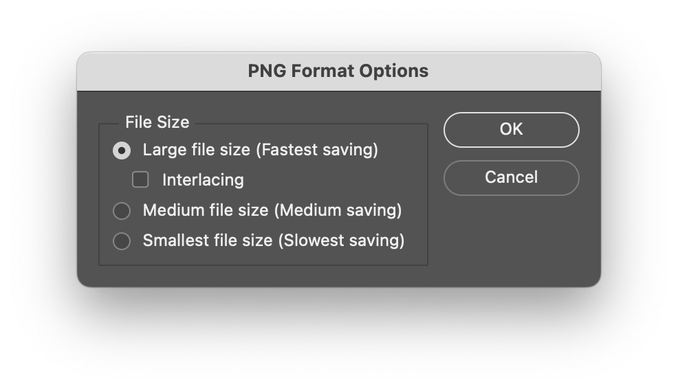
One of the frustrating patterns for me is a dialog box that doesn’t offer “skip it next time” option, or even just defaults to remembering.
My go to examples? Apple’s Remote Desktop which always throws this thing up on connection:
And this in Photoshop upon saving a PNG file, which has been there forever:
I never change these options. These are flow-killers; trees have grown to maturity as I have spent collective hours in those dialogs over the years/decades, even though they serve no purpose for me.
(The worst part might be if you forget this dialog waits, and move on to do other things, and the operation you thought was completed never actually finishes.)
I was delighted by the Laws of UX website when it came out. The site was beautiful (it still is!) and it felt important to bring some of this stuff to designers earlier in their careers.
But the book based on the website was largely a disappointment, and seems like a good case study of an unsuccessful adaptation – it felt this was pushed to become a book without editorial help and without thinking too much about what makes for a good book.
The book lost a lot of what made the site great – it’s a pretty generic-looking production with flawed typesetting, an uninspired cover, and poorly sized and reproduced images. But chiefly, I also feel the book showed there is limited rigor behind the whole premise; the writing feels academic in the sense that it’s a little boring, but academic writing at least can be precise and follow process. Not here. The laws of UX are not “laws” in the traditional sense and the combination of “laws” presented, as well as examples of them in use, feel really arbitrary and sometimes at odds with the entire premise.
I felt disagreeing with the book often. For example, I feel the chapter about Doherty Threshold feels is teaching the wrong lessons (100ms is not enough for a bunch of things!). Or the advice on gradually deploying changes (Jakob’s Law) is missing a core component of maintenance and how to approach the contingent of users who will never graduate to the new interface if given a chance to stick with the old one.
I also started worrying that the book doesn’t fully understand how design works. From the very first page:
This project was somewhat unique in one specific way: I was being asked to justify a number of design decisions to project stakeholders, without any data to support them. Normally, when you have quantitative or qualitative data available to draw upon, this is pretty straightforward task – but in this case the data wasn’t available, so the process of justifying the decisions would have to be a little different.
This is… This is not what design is. This is never true. You rarely have the data – and if there’s data, it’s never netural, always at the mercy of people collecting it and people interpreting it.
My friend summarized it well – “design is not mathematical” – but at various moments the book suggests it’s as simple as knowing a certain “law” and applying it. This is perhaps most visible in the Aesthetic-Usability Effect chapter, which touches upon craft without really understanding it.
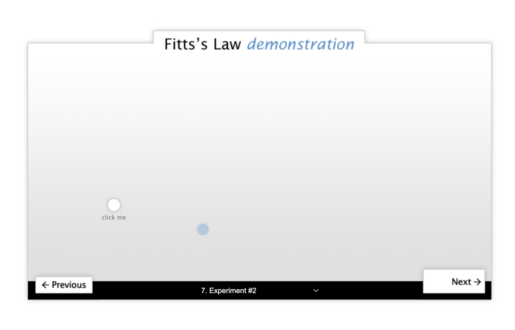
On the positive side: I think what the book is trying to do feels important and appreciated. Some of the stuff like Fitts’s Law or Doherty Threshold and Jakob’s Law are good to know about, they are still relevant, and can serve as useful tools in your toolkit as a designer.
I also learned some new things from it! I have never heard of shape coding before (turns out I’ve been practicing it without knowing, so learning about it was validating), and never really thought about the equivalent of heat maps for mobile.
Also: I don’t think this book is for me. I get a sense this is a volume for a very different group of UX designers, maybe even people at companies where UX design is not at all established as practice. There is a lot of stuff like explaining personas and basics of user testing and even ethics that feels somewhat out of place and like it’s padding the content – but I can see how that could be valuable. However, I still wish the book didn’t oversimplify a lot of things like I think it does. I believe there’s a way to do it while still keeping it accessible and not overwhelming.
But today, I would rather recommend the beautiful poster that seems more true to what the website was trying to aim for.
In terms of how I would improve the book:
Have it reviewed by someone who actually lives and breathes this stuff for living.
Invest in better writing and better storytelling. This of good stories and not just data. Ditch the random O’Reilly-esque callouts and integrate them into the stories.
Either get deeper into more specific and deeper examples for most of the stuff, or make it drastically shorter.
Don’t package it all as “laws”, or at least – if this title sells – contextualize it better inside. These are useful tools, but they are not laws like physics has laws. Also, all of them, like most of design, will be caveated with “it depends.”
Consider adding stuff about motor memory, Sturgeon’s Law, monotony, gestalt to flesh out the toolkit, and maybe group the chapters into a few bigger areas.
When you accidentally rename a file to a name that already exists, Finder tells you about it, and then just dumps you out of rename, so you have to enter rename mode again and type the desired name.
This feels like such a 1990s way of doing things: throwing a dialog box and washing your hands away from the responsibility to make things smoother and more fludi.
It’s not hard to imagine a better solution that returns you to rename mode and keeps the name you entered so you can refine it, or even something that eschews the dialog box altogether, and does something simpler like a password shake or a little callout.
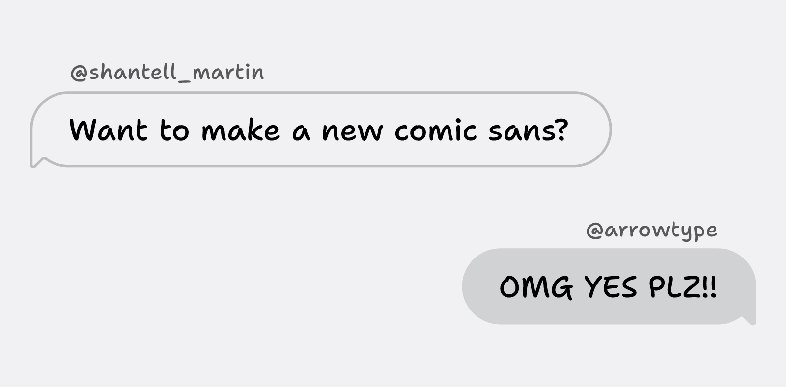
I hate most font reveals; they’re written in a pretentious, corporate-meets-Design-with-capital-D way that’s devoid of any value or meaning or feeling, with the requisite highly polished motion graphics that feel pretty like empty sugar calories. They did feel like written by AI before that became a meme.
When I was 20 or 21, I found out that I was dyslexic. When I started my art degree at Central Saint Martins in London, I was in an environment where it felt like the majority of people were dyslexic. I was instantly part of a cool group of creative people. However, I was disappointed about the amount of teachers who had never spotted my reading challenges. Instead of supporting me to learn to read and write, they punished me.
What I liked about this post is that it hands the mic off to other involved people: Stephen Nixon who “produced” the typeface, and Anya Danilova who took care of the Cyrillic side. It’s a simple technique, but I feel much more effective than doing the “oral history” a.k.a. “journalistic” approach of different people having various quotes interspersed. It can work, but only if you do it really well. Almost no one does it really well.
There’s just so much to love here. The motion graphics are actually useful, informative, and allow you to learn things! Even the “in use” photographs are delightful and don’t feel arbitrary.
Just well done all around.
(Also, I hate Comic Sans, so having something new in the same vein will be genuinely useful.)
I don’t know if I disagree with everything here, but there’s a lot of great stuff in there, and a lot of food for thought.
Highlighting everything is like assigning “top priority” to every task in Linear. It only works if most of the tasks have lesser priorities.
I thought the mention that comments should be visually promoted, not demoted, was particularly insightful.
Also, the idea that light themes are not popular because the colors are duller… this is very interesting. It could be so interesting to try a light theme with very prominent chiefly at the periphery of Display P3.
I have never been very invested in syntax highlighting because I find the UI to change it in text editors is usually pretty harrowing, but now I’m interested.
Chapanis began interviewing pilots who had crashed B-17s and B-25s and a pattern emerged that turned his attention to the controls within the cockpit. As Fitts said ‘the intense effort to produce new weapons, the race against time in industrial production, and the magnitude of the program required to train men to operate these new machines resulted inevitably in many instances in which the final man-machine combination failed to function effectively.’
What Chapanis found when inspecting the cockpits of these planes were two identical toggle switches side by side, one for the landing gear, the other for the landing flaps. These controls were also similar in size and shape. […]
He modified the landing gear control by adding a wheel-shaped knob and a wedge like shape to the wing flap control. Now pilots could feel and easily map the shape to the intended purpose. […] Chapanis had solved a real life and death issue with one brilliant insight.
Chapanis was a contemporary of Fitts of Fitts’s Law fame.
I forgot this was called “shape coding,” or perhaps I never knew that? I have employed and sometimes pushed for a similar thing, but I called it making sure things have “distinct visual signature” or something like this. I think “shape coding” would be a more appropriate term.
The article shows one simple UX example – I would love to learn more about who’s employing this deliberately. It is, after all, the opposite force to consistency, and I’m always interested in negotiating with consistency.
I’m sure that, in the right place and time, transparency effects of Liquid Glass can be visually pleasing. Not only is this the wrong time and place, but those with visual impairment can no longer remove or even reduce these effects, as the Reduce Transparency control in Accessibility settings no longer reduces transparency in any useful way.
I have heard so many bad things about Liquid Glass specifically on Tahoe that I’m holding on and not updating at this time. Something tells me I might have to skip a version or two altogether, which feels unprecedented in the modern Apple times.
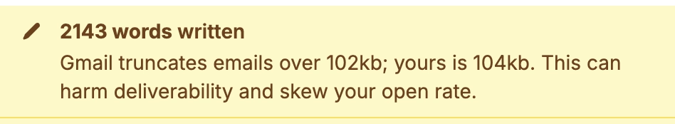
A thoughful moment in Buttondown. Gmail’s truncation has been going on for decades, and I have no idea why they still do this. Even the overflow interface for a truncated email is awful – the rest of it doesn’t appear in situ, but it opens a new window that where you have to start from the top.
One thing I really admired in earlier versions of Windows was the thing that was also its weak point: the keyboard orientation.
I miss the old tradition in Windows where many commands had underlined letters, and you could simply press Alt and that letter to jump to it:
If I remember correctly, eventually this got simplified so that the underlines were only there when you held Alt (although I bet there was an option to keep showing it all the time).
Opening Windows 11 today, it feels like the system got less elegant. I can still press Alt and stuff happens, but it doesn’t look nearly as good or tightly integrated, and the two alternate entry points (Alt and the keyboard shortcuts) become muddled:
In the meantime, on a Mac, in various places apps reinvent the wheel by their own thing.
I just saw this in Nova, the code editor, which is very thoughtful; those shortcuts only exist within this dialog (and one wonders if they couldn’t just be letters without modifiers)?
A little more old-fashioned from Photoshop, and the same question: could they just not be digits, without requiring ⌥?
Previously, I mentioned yet another idea from DevonThink.
I appreciate these gestures toward moving faster via a keyboard, but I wonder if we lost something that already used to work well in old Windows.
A funny 12-minute video by Chris Spargo about why traffic signs in the world are standardized only to some extent. This was interesting to me generally in the context of Europe being more iconographic, and America being more “word-y” in their sign design, which extends to devices, keyboards, and (presumably?) software.
The story why [the old STOP sign] got replaced by the American version is also the story why the rest of our signs still look different, and why they probably always will.
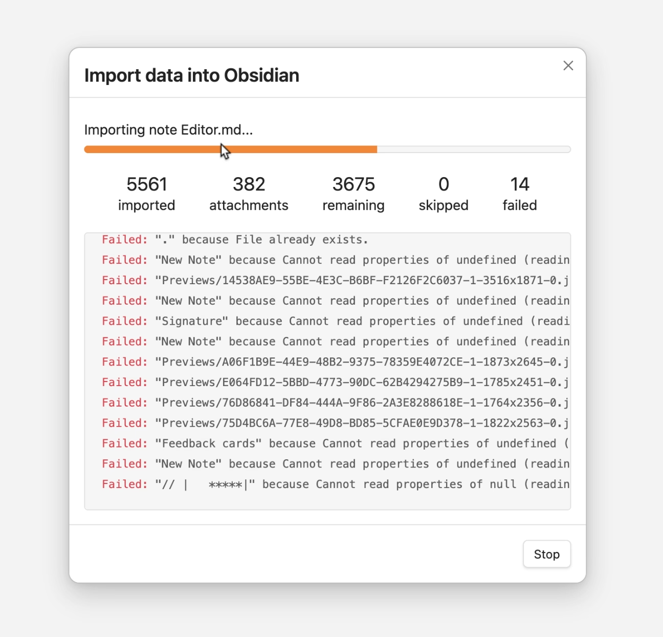
I am starting to collect all the problems I routinely find in Finder. I can think of ~15 off the top of my head; maybe this will turn into an essay of sorts. I hope this isn’t too boring for you.
Sometimes Finder takes a really long time to update the list of files after something changed it.
All my screenshots go to a specific folder. In these videos, you can see me taking screenshots with ⌘⇧4 while looking at the folder where they arrive.
The first one is fast – just as fast as it should be. The ones after that arrive with a few seconds of delay that feels completely random.
But this is nothing compared to this, just a few minutes later, where the delay was over 50 seconds. Nothing changed. The computer was not under load.
This happens routinely and feels completely random.
There is also, as far as I know, no way to force a re-sync with a keystroke or a button or a pull-down gesture, which could be at least a way to manually alleviate the symptom (if not the cause).
Hearing what others told me and based on prior experiences, I don’t have high hopes for any of this, but I want to be a good citizen. So I am filing bugs with Apple for all of these. I do not believe I can link to this directly, but the report I filed for this one is FB21444299.
There’s a common assumption that when you translate something from English into another language, there shouldn’t be any English left when you’re done. Otherwise it would be an incomplete translation, right? And you’d feel like you got cheated out of the money you spent on translation, right?
I have been thinking a lot about translation ever since in the 1990s, both Windows and Mac OS have been translated to Polish, and while Windows felt okay, people at Apple used more “proper,” but often strangely archaic words for the Mac OS translation that were absolutely readable, but made the Mac felt a bit… I don’t know… medieval? (I saved both of the translations and put them up online long ago. They are still online.)
It is so hard to explain unless someone knows both languages in question, but so important to understand all these little nuances to get it right.
In the world of typing, for example, right-to-left writing systems are not just “going the other way,” but also have to accomodate LTR snippets. Similarly, is perfectly fine in Japanese to see Western words – not just next to Japanese writing, but sometimes inside it. For those working on these, it must be annoying that you already have to do more work with more complex writing, encodings, and stuff (most languages to me feel more complicated than English) – but now you also have to include entry points for other writing systems.
The issues of translation are fascinating to me. Please send more if you see them.
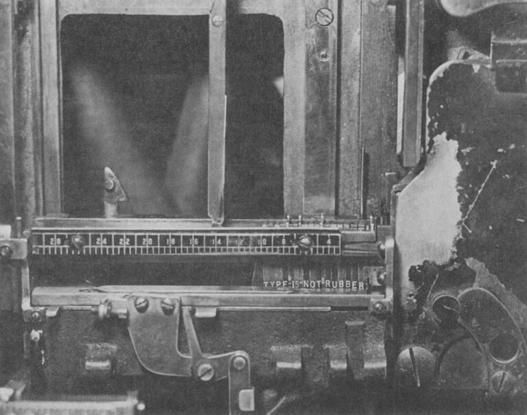
Oh, this is a fantastic adage I haven’t heard before, mentioned here in 1978, arguing against distorted, or “faux” typography:
A Linotype assembly elevator with the gate closed. This is the center of an operator’s attention as the mats tumble down and are arranged automatically in lines. The spacer bands adjust themselves to fill out the line but only so many letters can fit in any measure, proving the old trade adage that "type is not rubber." Modern photocompositors have lenses that can distort the image of the letters to fit where they couldn’t. Today, type is rubber.
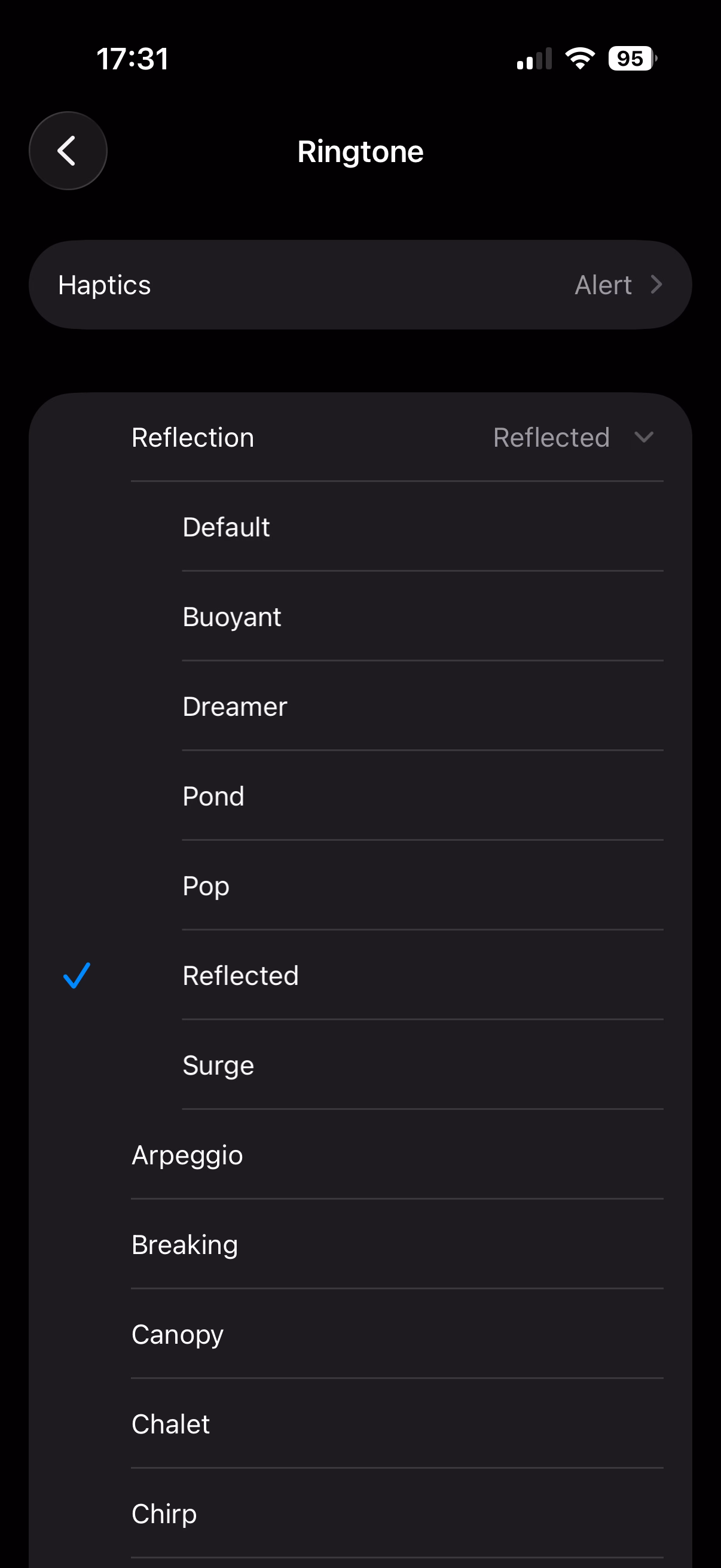
I found this weirdly delightful: There are a few new ringtones in iOS 26, but they’re not new new ringtones – they’re sort of “riffs,” or maybe remixes of a default Reflection ringtone.
If you don’t have an iPhone, here’s a short video where you can hear them. I’m guessing Apple sees the default ringtone as sort of an audio brand, and wants to invest in it more.
The only thing I don’t like are those names: It feels each one is following a different naming scheme.
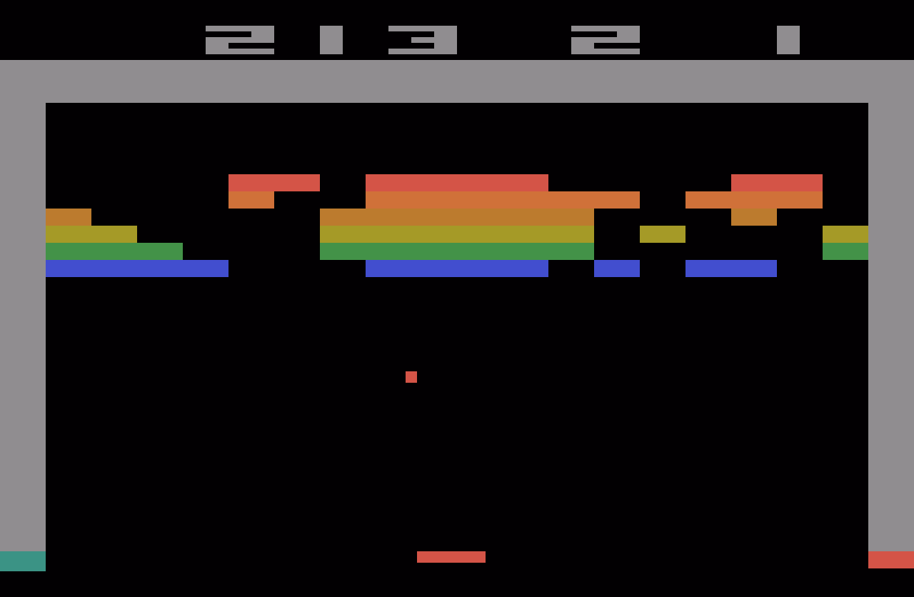
September 6, 2014, was a landmark day in speedrunning history.
I like Summoning Salt’s videos about speedrunners because they manage to add a great dose of storytelling to what otherwise would be boring, mundane events, and this one about Punch-Out is no exception. It’s Rocky meets Moneyball, in a way.
This pairs well with the previous review of the “Pilgrim in the microworld” book because speedrunning feels very connected to mastery and to quality – whether it’s because of the old-fashioned grind to be better, or by exploiting all sorts of glitches in the game to shave off sometimes milliseconds. The video above is in the former category, or what speedrunners would call “glitchless.” It’s also just really fun to watch. (The book wasn’t fun to read.)
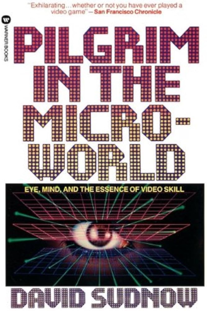
When I first learned about this book from Jacob Geller’s video just months ago, I thought this was another example in the vein of The Power Broker – a perfectly Marcin-coded book that somehow escaped me knowing about it for decades.
“Pilgrim” is from 1983, and is a story of a pianist discovering the classic videogame Breakout, and trying to perfect his own gameplay.
I love so many stories of videogame mastery, because at times they feel the closest we got to Doug Engelbart’s dream of incredibly effective machine operation somewhere deep below the threshold of consciousness: You and the computer becoming one, eyes and fingers forming feedback loops so perfect they cease to be noticeable.
Here I am alone in a pitch-black hotel room, a middle-aged man with some time to kill, getting ready to check out some jazz clubs in Greenwich Village, in possession of an early cretinous offering from a gold rush grab bag of tuby thingies coming our way from hundreds of decision-making puzzle peddlers throughout the new electric “entertainment” industry. And now instead of playing the game it‘s packaged up to be, I‘ve gotten into more or less occupying myself by outlining invisible triangles across the screen of a TV doodling machine. What am I doing?
Unfortunately, as you can maybe already sense, the book is an overwritten, ponderous, and pretentious mess. “Beach reading, it ain’t,” quipped a Kill Screen reviewer in 2013. But there are some interesting parts in it.
Before, the piano was the quintessential human instrument. Of all things exterior to the body, in its every detail it most enables our digital capacities to sequence delicate actions. Pushing the hand to its anatomical limit, it forces the development of strength and independence of movement for fourth and fifth fingers, for no other tool or task so deeply needed. This piano invites hands to fully live up to the huge amount of brain matter with which they participate, more there for them than any other body part. At this gnetically predestined instrument we thoroughly encircle ourselves within the finest capabilities of the organ.
Then a typewriter, speeding the process whereby speech becomes visible, the extraordinary keyboard for sequencing and articulating perhaps awaiting a still truer sounding board, strings, and tuning, a still more suited canvas for thought.
Then TV.
This arrives at page 26. Alas, it’s kind of downhill from here.
The author visits Atari (imagine that!) to learn that the programmer of Breakout doesn’t really understand what makes Breakout so alluring. The game perhaps lucked in to being so imminently playable, and then replayable.
I’m interested in designing for mastery. We should not rely on luck that separated a classic like Breakoutfrom a hundred other games from that era that felt awful to play and were immediately forgotten.
Sure, Sudnow definitely takes Breakout way too seriously:
Maybe I can remember the five shots by putting pieces of tape on the TV cabinet to mark each paddle destination, I say to myself, even though it seems that would undercut true learning. It’s bad practice to learn the piano by writing the names of the notes on the keys, much better not to use a code, to grasp the layout of things by their own looks and feel. And I can’t carry Scotch tape to a Breakout tournament.
But in a way: why wouldn’t you?
In fact it’s already happening. I’ve found myself playing with the cursor on my word processor just for the hell of it, seeing if I could track it across screen and get it to stop at every comma in the text.
The word processor (or any other app you use often) operating at the speed of fingers unlocks superpowers, and then some.
There’s one experience in particular at the word processor that gets me downright angry at times. There’s no more of that room for finger breathing while you awaited a carriage’s return. You reach the end of a processed line of text and if your word becomes too long for the margin while there’s still alloted space to get it underway, it splits in the midst of your articulation and your voice instantaneously reappears six inches to the left, a quarter of an inch lower. The computer can’t know what you’re about to write, not yet, not a word or even a letter in advance, has to wait and merely calculate how things are going in order to then “decide” where to put the sound. ¶ Before, you felt a big word welling up, hit the carriage return, lifted off from the keyboard just a bit, reorganized your grasp, and dug back into the improvisation with a renewed rhythmic mobilization to continue. And some of the things you found to say, you found because you said them that way.
This was a fascinating tidbit, this reflection on how small interactions can change the nature of creative process.
If this book was cut to 20% of its size, those fascinating tidbits would stand out more, and the book would still be of value today.
But despite this complaint, I miss people writing about using computers this way. Such a big chunk of my struggle with computers today is fighting with it because I expect a better connection between my fingers and what’s happening onscreen.
I wish more designers understood how important that is.
When you make dialogue in a video game you have a distinct file that has all the possible text that can pop up in your game. This is usually a CSV file, or a JSON, and you can think of it as basically a database for text. So then at different parts in your code, you extract specific parts of this file, and that'll depend on what character you’re talking to, if you have a certain item, whatever, and that’s one of the most efficient and common ways to do it.
But the way that Undertale handles dialogue is much worse. All of the dialogue in the entire game, every text box that pops up, is handled in one massive if statement. […] case 737 out of what must have been at least 1,000 lines.
This reminded me a little of my first week with my personal computer, when I didn’t yet know you can write IF X <> 3 THEN, so I spent half a day writing statements like IF X = 1 OR X = 2 OR X = 4 OR X = 5…
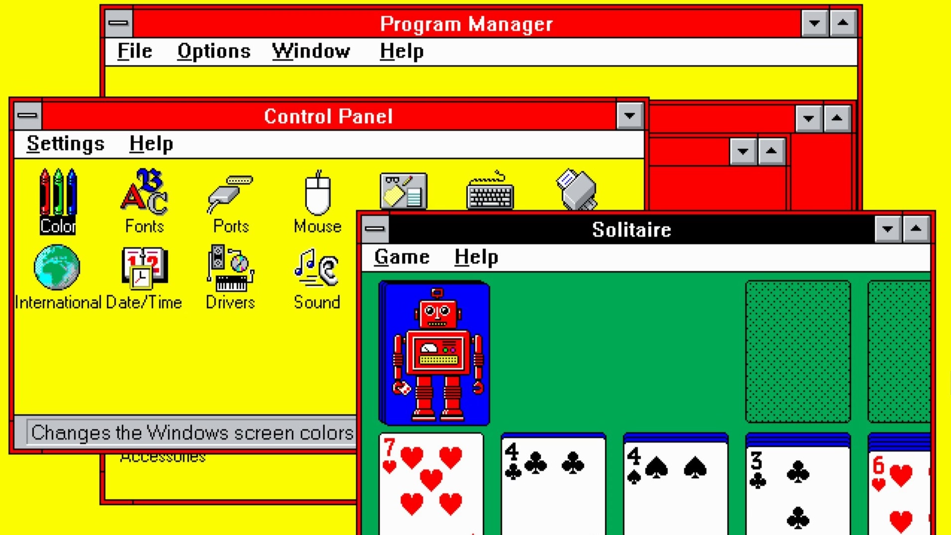
Every so often, a wonderful thing happens: someone young enough to have missed out on using computers in the early 1990s is introduced to the Windows 3.1 "Hot Dog Stand" color scheme.
I can’t figure out whether Gruber’s take (“That’s Microsoft.”) is also a subtle jab at Apple in the year of Liquid Glass.
Also, great first comment under the original post:
I assume "Plasma Power Saver" served an actual purpose - it was intended for users of "portable" machines having a gas plasma display. Early ones were monochrome (orange) and I guess the actual color hue didn't matter so much as the intensity.
It used to be that when you dragged an item off the Dock and dropped it, the icon would disappear in a puff of smoke and make a satisfying noise. The animation was strangely primitive against the backdrop of the slick user interface of what used to called Mac OS X.
I too wondered why that animation was weirdly amateurish, almost like a placeholder. Well,
One of the most talented engineers on the team took out a piece of paper. I wish I could say it was a napkin to make the story better. ¶ On the piece of paper, he drew a series of five frames. The intention of the designer was that these drawings would stoke further discussion. That it would get cleaned up and refined later. ¶ But that never happened. It shipped as is. And the rest is history.
This is inside my Sony Alpha camera: a teensy too technical, or maybe slightly-lost-in-translation-from-Japanese message. I love it. It has personality without trying to be cute.